Stand Design

Our 3D Designs

Sixteen designs: exhibition stands, Founding Day concepts, corporate events and sports venues. Open any one to browse it frame by frame.

3D Visualisation

Designs

16 designs
Riyadh Chamber stand — open-sided exhibition stand design by Arena RiseStand open on all sides
Riyadh Chamber

Riyadh Chamber stand

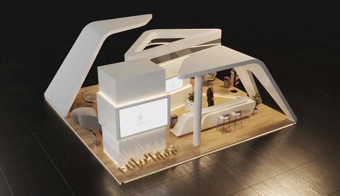
A single curved canopy over a stand open on every side — no front elevation and no back.

Design detail

We designed and built the Riyadh Chamber stand on one governing decision: that it be open on every side. No front elevation and no back — the visitor enters from wherever they arrive, which raises the number of entry points and with it the chances of engagement. A single curved canopy carries both roles at once: from a distance it reads as a sculptural element marking the stand's position in the hall, and up close it provides shade and defines the space. The palette is contemporary and quiet — soft cream over a warm timber floor — reflecting the Chamber's identity without shouting it.

Client
Riyadh Chamber
Treatment
Curved canopy and open plan
Materials
Cream surfaces and timber flooring
Documentation
7 shots and drawings
  • A wide view of the stand: the curved canopy defines the space without closing it.
  • The stand from the opposite angle — no single frontage acts as the entrance.
  • The curve of the canopy as it drops to meet the stand floor.
  • The canopy as a sculptural element in its own right, legible from across the hall.
  • The reception counter under the canopy, and the stand read at human scale.
  • The internal area and the circulation between its several entry points.
  • The construction drawings and elevations the stand was built from.
Halliburton stand — product display exhibition stand by Arena RiseProduct display stand
Halliburton

Halliburton stand

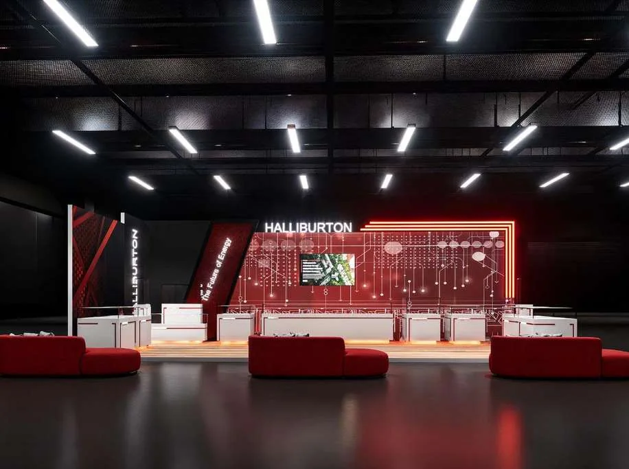
An extended red wall carrying the identity, with ordered display plinths in front on a natural timber floor.

Design detail

A complete stand for Halliburton, built to present products in a language combining refinement and innovation. The treatment rests on an extended red wall that carries the identity and acts as a single visual backdrop for the entire stand, with display plinths arranged in front of it in an order that leads the eye from one product to the next without crowding. The choice of materials is what carries the sense of quality: natural timber flooring, polished acrylic, and contemporary metal accents — a combination that makes the stand look elegant and modern at once. Alongside the display, comfortable seating turns passing traffic into conversation, so the stand becomes a place to work rather than a frontage to look at.

Client
Halliburton
Treatment
Extended identity wall and display plinths
Materials
Natural timber · polished acrylic · metal accents
Documentation
6 shots and a top-down plan
  • The extended red wall with the display plinths in front — a single visual backdrop for the stand.
  • A wide view showing the stand's reach across the darkened hall.
  • The arrangement of display plinths and the path the eye follows.
  • A side view taking in the display plinths, the identity wall and the red seating corner.
  • The full frontage from mid-aisle — the lit wall, the run of plinths and the timber floor.
  • The internal layout plan with display and seating zones.
Hajj Services Coordination Council stand — exhibition stand design by Arena RiseCorporate stand
The International Pilgrims Services Companies Coordination Council

Hajj Services Coordination Council stand

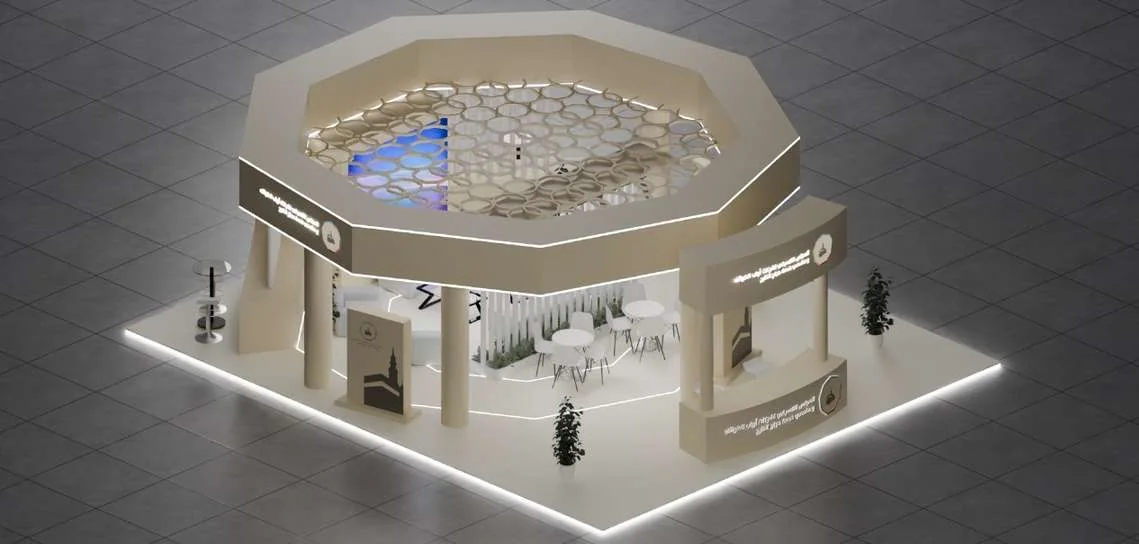
A corporate stand in a cream palette under an arched canopy, built on four criteria: draw, function, identity and interaction.

Design detail

The stand for the Coordination Council of International Pilgrims' Guides and Service Providers, designed against four explicit criteria before a single line was drawn: visual draw through colour, lighting and graphics; function through a plan that eases movement and makes room for interaction and display; identity, so that the stand speaks the Council's name and colours; and interaction through screens and a meeting area. The architectural treatment befits the gravity of the mission: a warm cream palette, an arched canopy framing the space, and a honeycomb ceiling drawn from traditional geometric ornament — a language that says "guests of the Merciful" without explanation.

Client
International Pilgrims Services Coordination Council
Criteria
Draw · function · identity · interaction
Treatment
Arched canopy and honeycomb ceiling
Documentation
4 shots and drawings
  • A top-down view showing the octagonal form and its openness on every side.
  • The reception counter and the screen built into the stand structure.
  • The identity frontage in cream and gold, carrying the Council's name and logo.
  • The floor plan: zoning and circulation routes.
PropTech twin stands — two-concept exhibition stand design by Arena RiseTwo stands, two designs
Proptech

Two Proptech stands

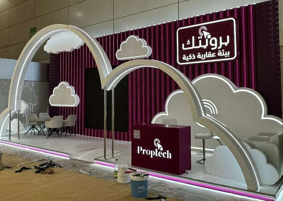
Two different designs for the same brand at the same show — the cloud and arches motif, then a digital frontage.

Design detail

Stand design is the craft of shaping a small space that tells a whole story: in a single moment the visitor takes in the coordinated colours, the considered lighting and the clear identity. And because beauty is only complete when elegance meets function, the stand was built on three elements: a refined surface for displaying products, an open space for networking and interaction, and simple visual touches that leave a lasting impression. We delivered two different designs for Proptech at the same show: the first built on the cloud and arches motif in a magenta and white palette, the second on a digital frontage with a large screen and magenta lighting — one identity, two spatial solutions.

Client
Proptech
First design
Cloud and arches motif
Second design
Digital frontage with a large screen
Documentation
4 shots
  • First design: the cloud and arches motif in a magenta and white palette.
  • Second design: a refined display surface and open space for networking.
  • The digital frontage with its large screen and magenta lighting.
  • The stand's extended frontage as read from the aisle.
Arkaz stand — two-concept exhibition stand design by Arena RiseOne stand, two designs
ARKAZ

Arkaz stand

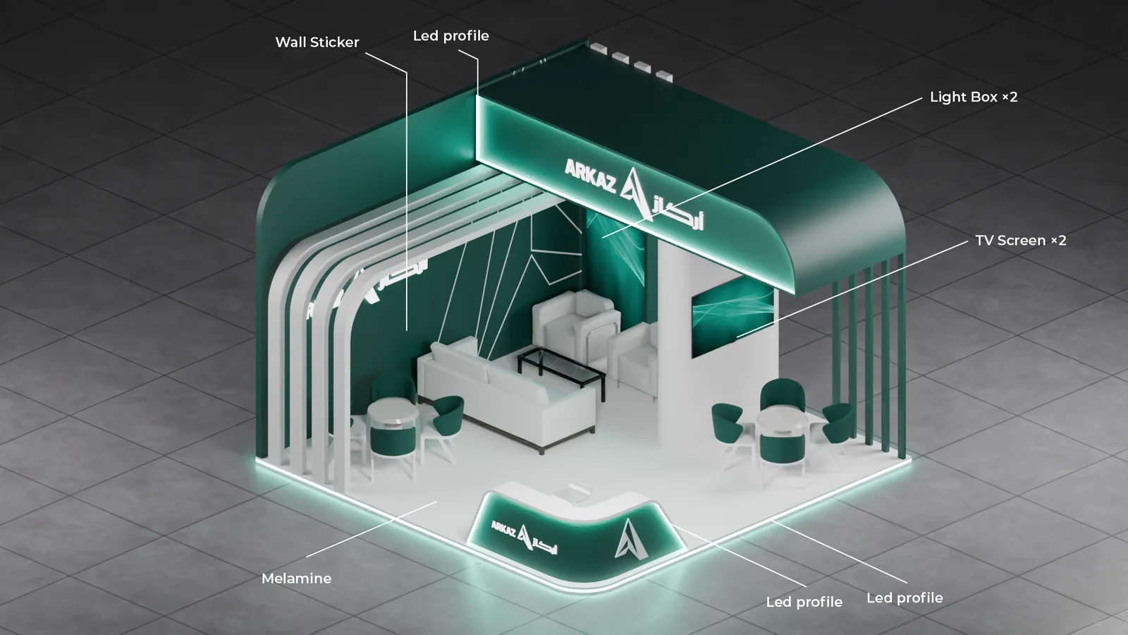
Two designs for one brand in a single palette: an open corner under a white canopy, and a barrel vault carrying the identity in light.

Design detail

Two proposals for Arkaz in a single palette — deep turquoise green and white. The first is a corner open on two sides: a ribbed wall carrying the logo, a curved white canopy shading the seating area, and a round totem at the aisle edge with a vertical screen and the site address. The second is wider: a barrel vault wrapping over the stand with a lightbox carrying the identity at its front, a lounge and two meeting tables beneath it, and a run of white fins opening the side elevation. Both designs share an LED light line around the stand floor and a curved reception counter carrying the brand. The views are annotated with their materials and screen sizes — melamine, acrylic and P1 LED panels at 2×1.5 and 1×1.5 metres — so the client reads what will be fabricated, not merely what looks attractive.

Client
ARKAZ
On display
Two alternative designs
Screens
P1 LED at 2×1.5 m and 1×1.5 m
Documentation
2 shots
  • Second option: a barrel vault and a lightbox carrying the identity above the lounge.
  • First option: an open corner with a ribbed wall and a round totem at the aisle edge.
Al Moallam stand — corporate exhibition stand by Arena RiseCorporate stand
Al-Muallem Facility Management

Al-Muallem stand

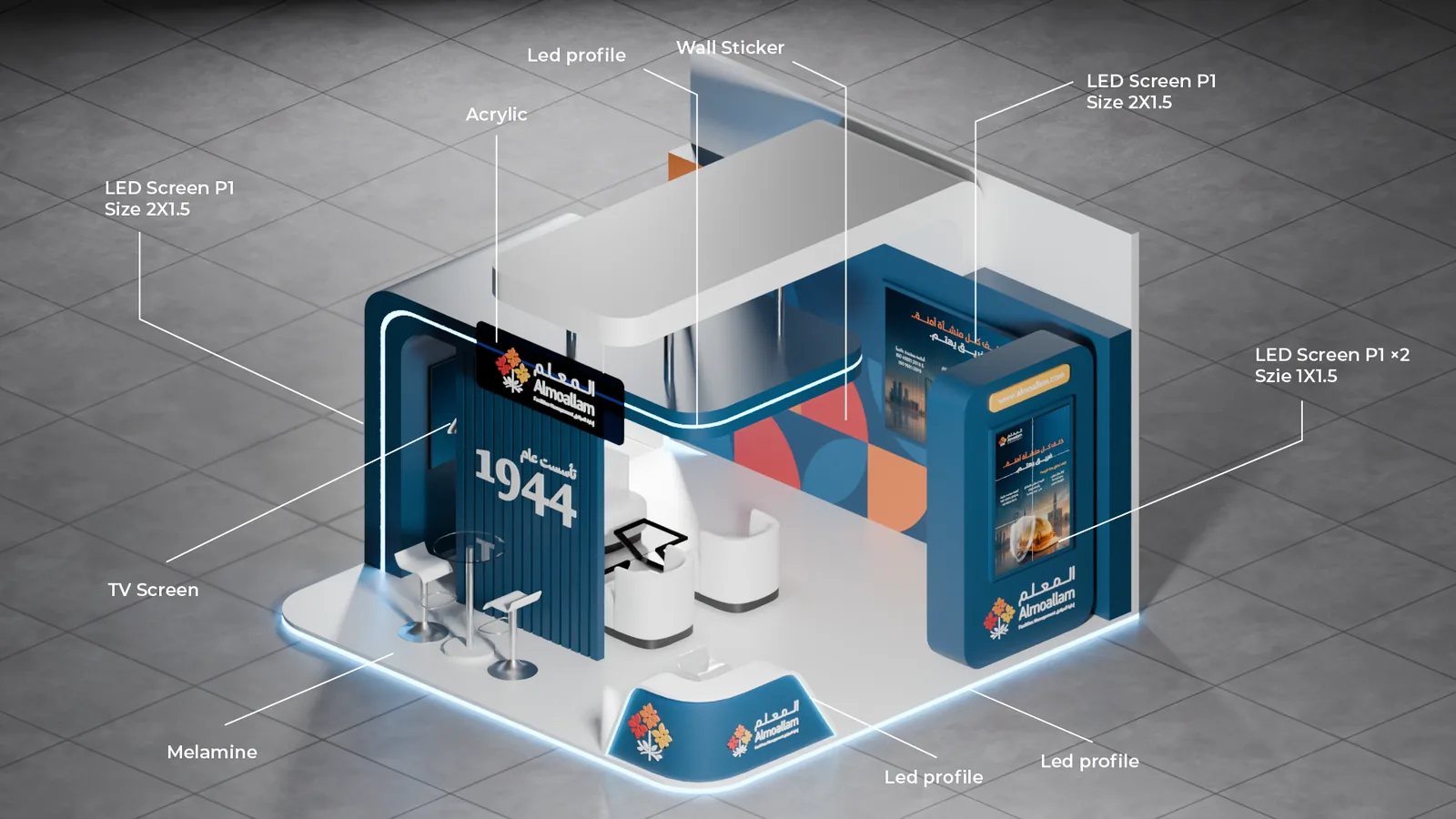
The founding year 1944 is the hero of the wall — one large number stating the company's age before any line of copy.

Design detail

A stand in a steel blue and white palette. The main wall is vertically ribbed and carries "Established 1944" in large white numerals: the first thing the visitor sees is not a description of the service but the company's age, which a newer competitor cannot easily match. Above it sits a lightbox with the logo; at the aisle edge, a round totem with a vertical screen and the site address; and behind the seating area, a wall of interlocking circles in the identity colours. The seating is white benches and high chairs around a glass table, the reception a curved counter carrying the brand, and an LED line runs around the floor. The views are annotated with their materials and screen sizes: melamine, acrylic and P1 LED panels.

Client
Al-Muallem Facility Management
Governing element
Founded 1944, on the wall
Screens
P1 LED at 2×1.5 m and 1×1.5 m
Documentation
1 shot
  • The ribbed wall and the founding year 1944, with the round totem at the aisle edge.
Amiantit stand — exhibition stand with ceiling ring by Arena RiseStand with a ceiling ring
AMIANTIT

Amiantit stand

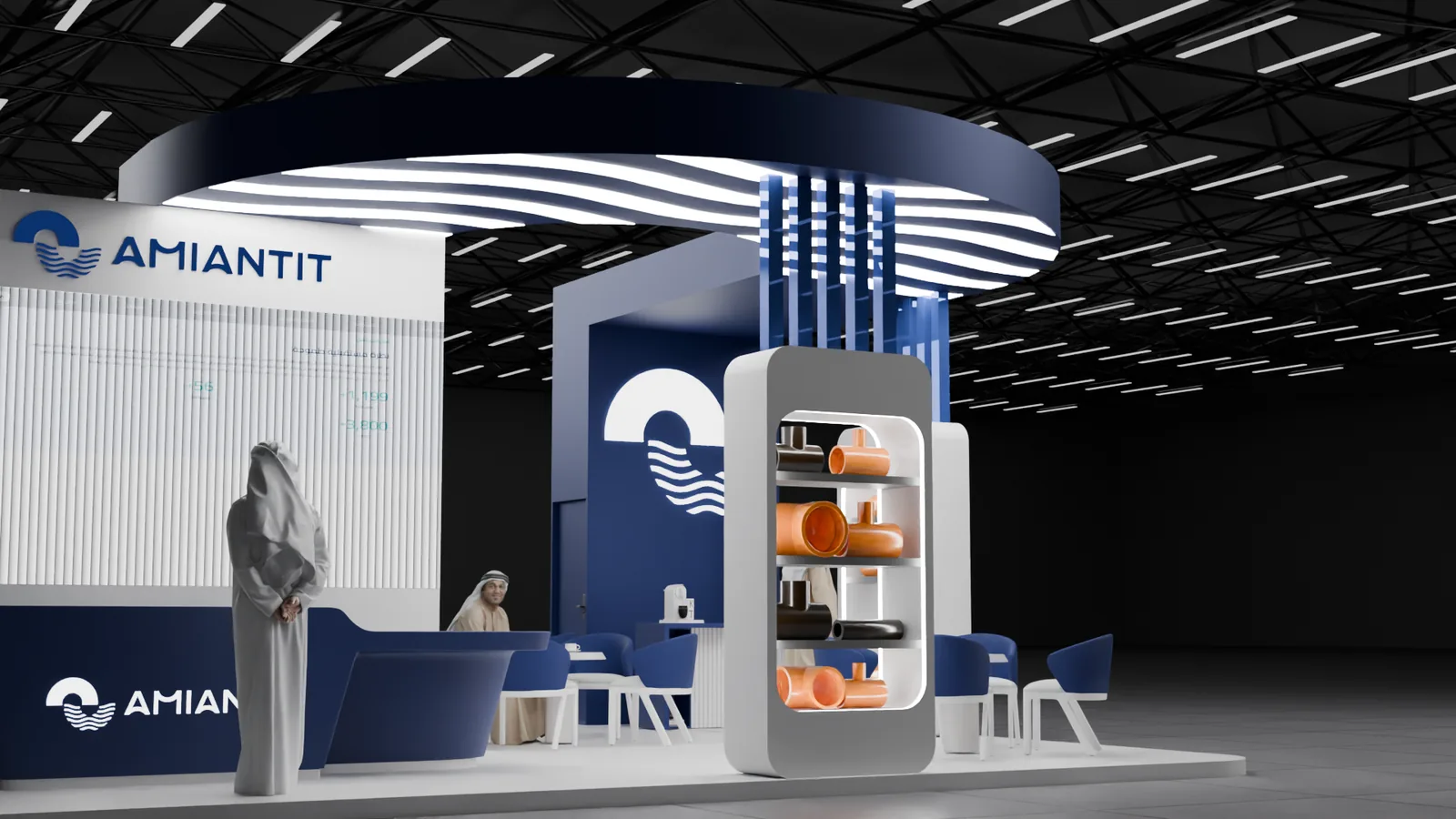
The logo's wave rises to the ceiling: a suspended ring of rippling light strips above a stand displaying the product itself.

Design detail

A stand in navy and white for a pipe manufacturer. The governing element is a suspended ceiling ring, its underside lined with rippling white light strips that redraw the wave in the company's logo — so the identity is not printed on a surface but turned into light visible from any angle in the hall. Beneath it, a navy gateway carries the brand mark, and in front stands a white display case with rounded edges holding pipe sections and fittings in their real colours: orange, black and white. The stand shows what the company makes, not a picture of it. On the aisle side, a full-height LED tower displays a field shot from a live site, pulling the visitor in from a distance before they read a name. Between the two sit white product shelves and a hospitality area with navy seating and white tables.

Client
AMIANTIT
Governing element
Ceiling ring with rippling light
Display
Real pipe sections in a display case
Documentation
2 shots
  • The ceiling ring with its rippling strips, and the display case holding the pipe sections.
  • The stand from the aisle: a full-height LED tower showing a shot from a live site.
Nama Chemicals stand — two-frontage shared exhibition stand by Arena RiseShared stand with two frontages
NAMA Chemicals

NAMA Chemicals stand

Two brands in one stand: a full frontage each, and a shared counter in the middle carrying both logos together.

Design detail

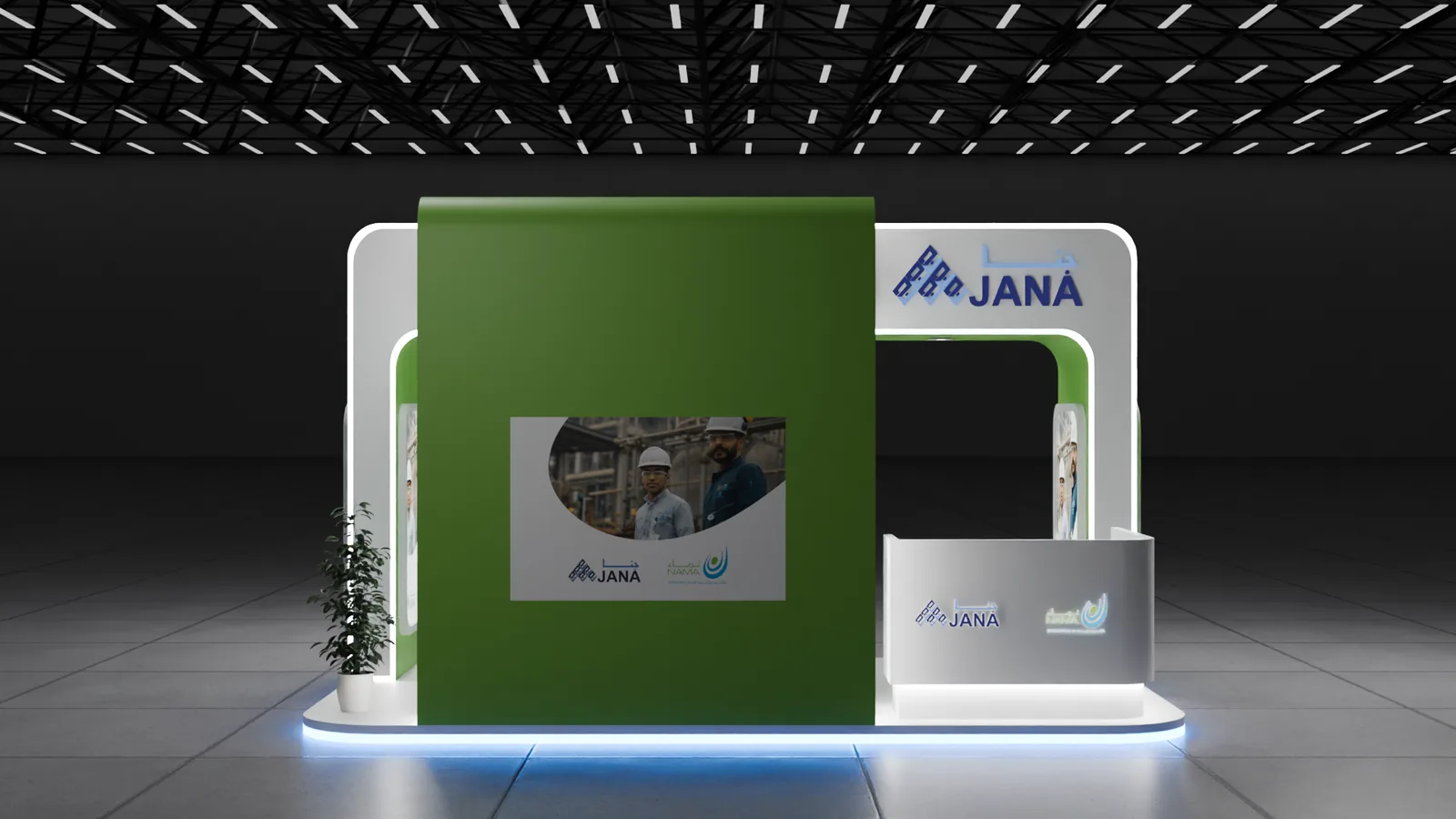
One stand for two companies — a situation that usually causes trouble, because each brand wants the frontage. The solution here lies in planning rather than concession: a white frame with rounded corners wraps the stand, and inside it a curved green wall divides the mass into two frontages — one carrying the JANA logo in its header, the opposite one carrying NAMA. Each frontage holds an image panel from the worksite showing both logos, so the partnership stays legible from either side. At the centre, a curved white reception counter carries both marks side by side — a single point receiving both companies' visitors instead of two competing counters. Inside is a white lounge with a wall-mounted screen, and a blue light line runs along the floor edge, unifying the stand visually from the outside.

Client
NAMA Chemicals
Status
Two brands in one stand
The solution
A frontage per brand and a shared counter
Documentation
3 shots
  • The JANA frontage: the curved green wall and the image panel carrying both logos.
  • The opposite frontage, with the NAMA logo in its header.
  • The shared reception counter carrying both brands, and the light line at the floor edge.
Founding Day “Youm Badina” concept — national occasion design by Arena RiseNational occasion design
Arena Rise

Yawm Badina — Founding Day design

Najdi architecture read in a contemporary language: a clay-toned wall with a crenellated edge, and carved ornament lit from behind.

Design detail

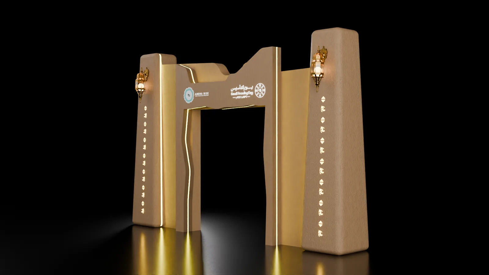
A complete design line for Founding Day, built on one decision: to read Najdi architecture rather than copy it. The wall takes the colour and texture of clay, its upper edge crenellated like the walls of Diriyah, and the Najdi ornament — triangle, arch and dots — is not printed on the surface but carved into it and lit from behind, appearing at night as inscriptions made of light. A warm LED strip traces the edges of the mass, separating it from the darkness and letting it read from a distance.

The line runs from the gateway to the stage to the photo corner: a stage framed by red and white Sadu drapes with an LED screen at its centre, copper lanterns on the columns, and a floor majlis with Sadu spreads and coffee pots. And a corner bringing together successive arches and lit shelves holding pottery and ceramics.

What separates good design from the rest is the detail: a close shot revealing the grain of plaster on a column, the copper reflecting off its surface, the cleanness of the reveal the light escapes through. We show this because it is what we build.

Organisation
Arena Rise — in-house design line
Occasion
Saudi Founding Day
Visual language
Najdi architecture · carved, lit ornament · Sadu
Elements
Gateway · stage · majlis · photo corner
  • The gateway against black: the crenellated edge, and the Najdi ornament carved into it and lit from behind.
  • The stage with Sadu drapes and the LED screen, fronted by a floor majlis with Sadu spreads and coffee pots.
  • The photo corner: successive arches and lit shelves holding pottery, with columns in illuminated Najdi ornament.
  • The detail: a copper lantern on a plaster-textured column, and the reveal the warm light escapes through.
Patio project — Founding Day full destination design by Arena RiseA whole-destination design
Patio

Patio project — Founding Day

Not a gateway at an entrance but a whole destination: a waterside walk, a bridge, lit gates and mobile cafés along the length of the project.

Design detail

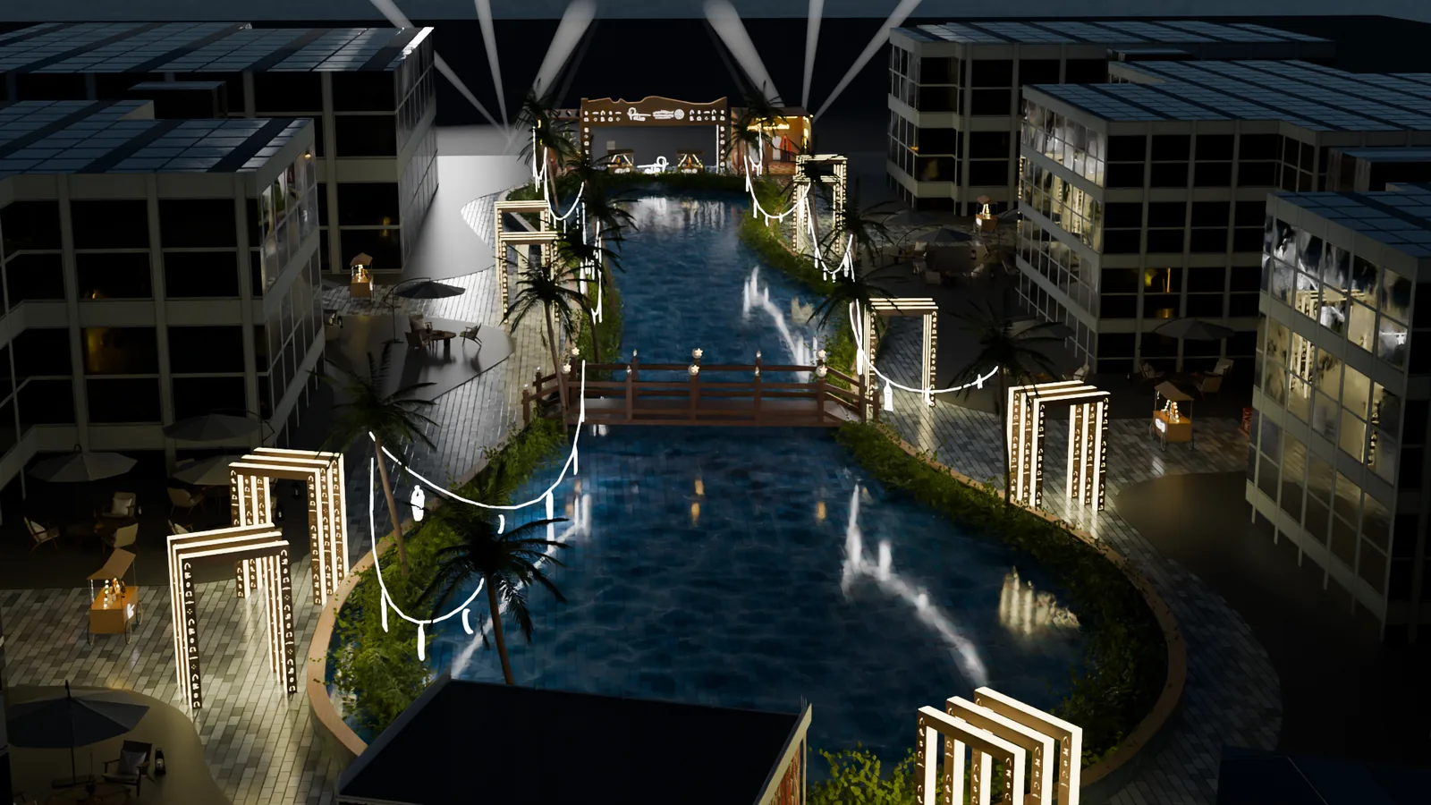
A project measured not by a single element but by a whole plan. We took the waterside walk at Patio and its surroundings and turned them into a destination for Founding Day: a main gateway with a crenellated Najdi edge carrying the project's logo in neon alongside the Founding Day mark; a series of smaller lit gateways repeating along both banks, guiding movement without a single directional sign; and lighting runs hung with lantern-shaped fittings stretching overhead, unifying an open space that had been disconnected.

Then the places to stop: mobile carts carrying the Patio identity, a photo corner with a timber bench, a Sadu throw, clay jars and a backdrop with a lit Najdi edge, and majlises in red and white Sadu with low tables on worked bases holding coffee pots and gilded hospitality dishes.

The aerial view is what settles it: it shows the elements are not scattered but set along a route — gateway to bridge to cafés — and that the lighting is designed as one layer across the whole project. That is a level of planning no furniture supplier reaches; it takes a company that designs the event as a whole and then builds it.

Client
Patio
Occasion
Saudi Founding Day
Scope
A whole destination, not a single element
Elements
Main gateway · repeating lit gateways · suspended lighting · carts · photo corner · majlises
  • The plan from above: the gateway, the bridge and the lit gates set along one route around the waterside walk.
  • The main gateway at night with its crenellated Najdi edge, the Patio logo in neon and the Founding Day mark.
  • The timber bridge and suspended lighting runs, with lit gateways guiding movement along both banks.
  • The photo corner: a timber bench, a Sadu throw and clay jars in front of a backdrop with a lit Najdi edge.
  • The majlises in Sadu fabric, with low tables on worked bases holding coffee pots and hospitality dishes.
Gulf Air event design — element programme with dimensions by Arena RiseA dimensioned element schedule
Gulf Air

Gulf Air event design

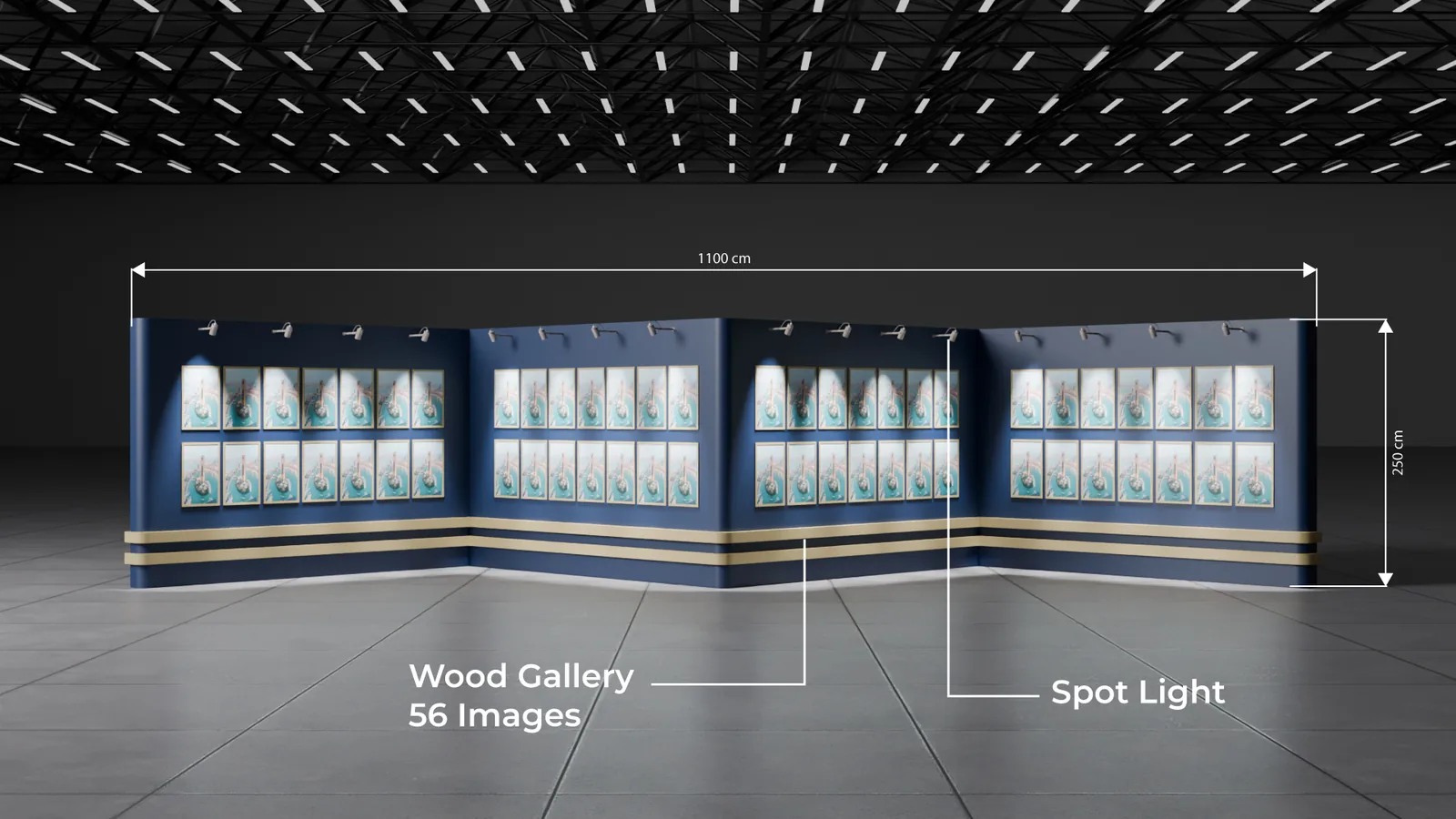
Every element drawn to the centimetre before fabrication: an 11-metre exhibition wall, a 175 cm logo sculpture, a 200 cm wayfinding sign.

Design detail

An event design delivered not as a pretty picture but as an element schedule ready for fabrication — and that is what separates an event company from a décor supplier.

The first element is a photographic exhibition wall 1100 cm long and 250 cm high, broken into four panels at angles that open the view to anyone walking past, carrying 56 framed images with directed lighting over each group, in the airline's palette: navy and gold with two horizontal bands at the base.

The second is the falcon carved in timber at 175 cm high by 170 cm wide, with longitudinal grooves through the wings and LED backlighting, on a base carrying the airline's name in Arabic and English — a photo piece in its own right, not a sign.

The third is a 200 cm wayfinding sign on an 80 cm base, with the falcon's wing wrapping around its body so the sign itself becomes an identity element. The dimensions are written onto the views because the client signs off on what will be fabricated, not on an impression.

Client
Gulf Air
Exhibition wall
1100 × 250 cm · 56 images
Logo sculpture
175 × 170 cm · timber, backlit
Wayfinding sign
200 × 80 cm · timber
  • An 1100 cm by 250 cm exhibition wall carrying 56 framed images under directed lighting.
  • The 175 cm backlit timber falcon sculpture, on a base carrying the airline's name.
  • The 200 cm wayfinding sign, with the falcon's wing wrapping around its body.
JESCO & ArcelorMittal event design — full event site design by Arena RiseFull event site design
JISCO · ArcelorMittal — Jubail

JISCO and ArcelorMittal event design

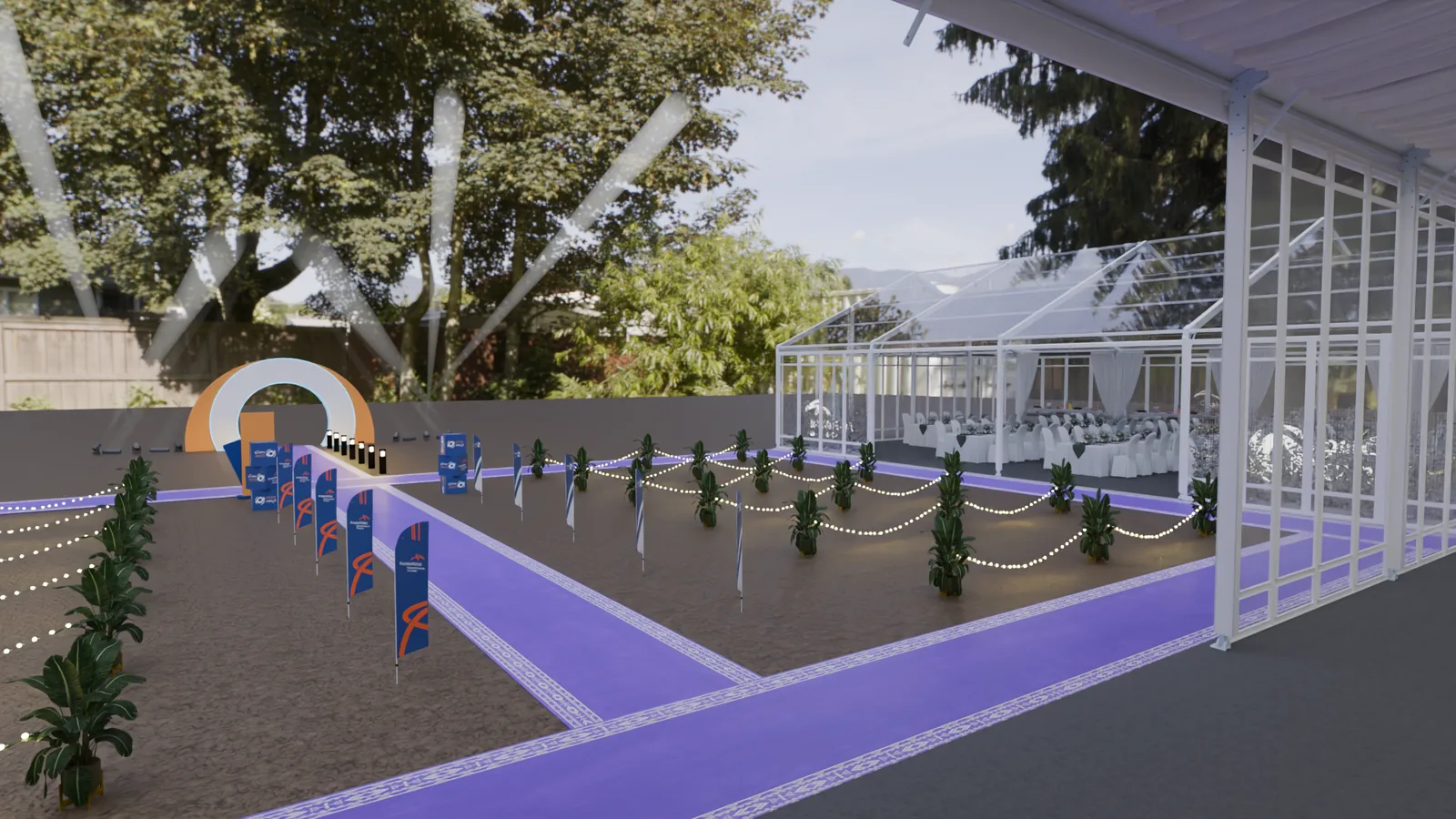
The plan first: carpet routes taking the guest from the gateway to the stage to the dining hall with no need for an escort.

Design detail

An industrial company's event in Jubail, designed from the plan rather than from the décor. Open ground became an ordered site through purple carpet routes with patterned borders, drawing on the ground the path the guest should take: from a lit circular gateway, along a walkway flanked by lighting columns and potted plants, to the reception tent, and on to the glass hall where dinner is served.

This is the difference between designing an event and furnishing one: the visitor never asks "where do I go?" because the floor answers, and the wayfinding signs in the brand's two colours — orange and blue — only confirm what they already know.

Inside the tent, a stage with a wide LED face carrying images of the plant, flanked by two navy panels: ArcelorMittal on the left and JISCO on the right — a partnership legible from the furthest guest's seat. The platform is white and curved with an orange light strip, facing rows of white seating. Outside, a Sadu tent in red and white shades the seating area, because an industrial event stays Saudi in its hospitality.

Client
JISCO · ArcelorMittal Tubular Products
Location
Jubail — Eastern Province
Governing idea
Carpet routes direct movement instead of signage
Elements
Lit gateway · walkway · LED stage · glass dining hall · Sadu majlis
  • The site plan: carpet routes linking the lit gateway to the tent and on to the glass hall.
  • The lit circular gateway, and the walkway with its lighting columns leading to the reception tent.
  • The stage with its wide LED face flanked by the ArcelorMittal and JISCO marks, facing the seating rows.
  • The wayfinding sign in the brand's two colours, with a majlis in red and white Sadu behind it.
TechnipFMC event design — industrial event with exhibition area by Arena RiseIndustrial event with a display area
TechnipFMC

Drilling event design — TechnipFMC

A subsea unit weighing tonnes presented as a museum piece: a lit plinth and an information panel, not a factory floor.

Design detail

An event for an energy services company, solving a problem anyone who has run an industrial event knows: how to display heavy equipment without the hall looking like a workshop.

The answer is in the treatment: the subsea unit stands on a raised purple plinth with clean edges, behind it a white information panel with rounded corners carrying the brand and the product description, and between them a blue light strip separating the yellow mass from its background so it reads as an exhibit rather than a machine parked in a hall.

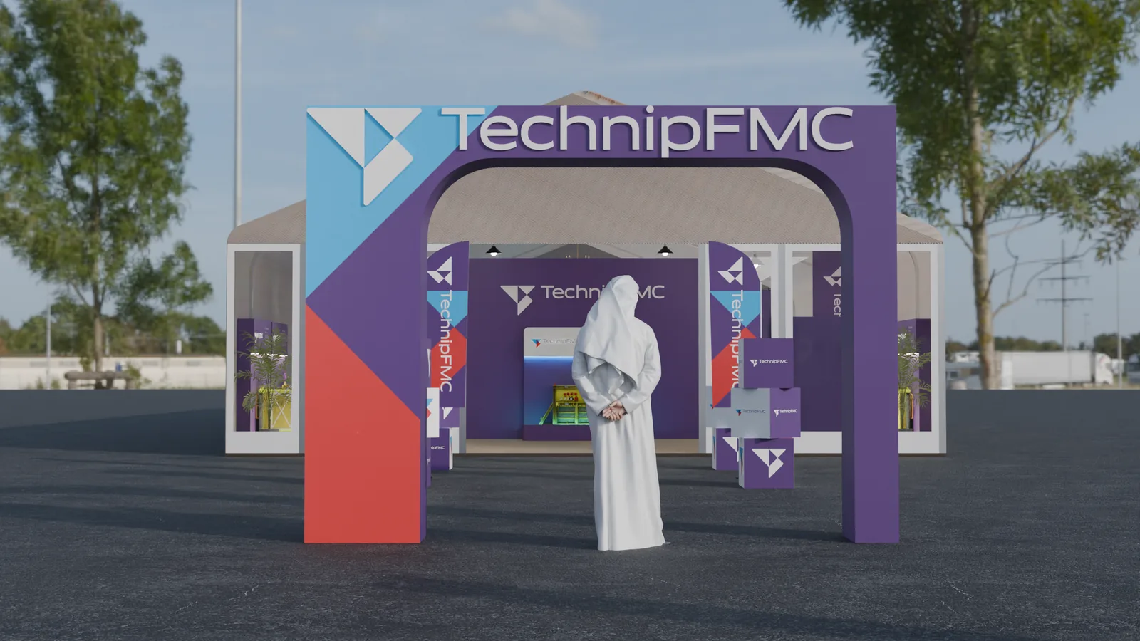
The identity governs the whole scene: the brand's triangles in purple, sky blue and red repeat from the main gateway to the feather flags to the floor cubes. And in the dining hall, round tables with purple runners and napkins folded in the brand colour, facing an LED wall carrying the campaign, and a stage with lit risers.

Then the detail that reveals the standard: a clear acrylic welcome card carrying the brand's triangles on every table. Whoever designs the table card with the same care as the gateway leaves nothing in between to chance.

Client
TechnipFMC
Event type
An industrial company event with a product display area
Treatment
The unit on a lit plinth, as an exhibit
Span
From the gateway to the welcome card on the table
  • The gateway marked with the identity's triangles, with the reception wing inside the tent behind it.
  • The identity wall with its triangular blocks separating the dining hall from the equipment display behind it.
  • The dining hall: round tables with purple runners in front of an LED wall and a stage with lit risers.
  • The clear acrylic welcome card with the brand's triangles, on every table.
Al Qadsiah House — sports events venue design by Arena RiseSports events venue design
Al-Qadsiah Club

Dar Al-Qadsiah

An events venue for a sports club: a stage, a history wall, a photo wall and a hospitality area — with one line governing every surface: "هنا دارك".

Design detail

Designing for sport differs from designing a corporate event on one decisive point: the audience already belongs to the brand, and the design does not build that belonging but gives it somewhere to happen. That is where the design for Dar Al-Qadsiah began — an events venue for Al-Qadsiah Club in the Eastern Province.

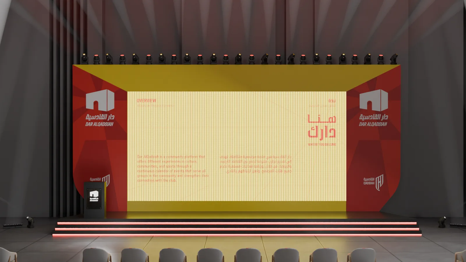
The line "هنا دارك · WHERE YOU BELONG" is not merely words on a screen; it is the decision that ordered the space. The main stage carries a wide LED wall in a gold frame with two angled red blocks bearing the venue and club marks, a moving lighting grid of twenty units above it, and lit risers with red strips separating the platform from the seating.

Alongside it, three elements turn the hall from a stage into a "home": the club history wall, a timeline dated from 1935 that tells the story of the founding and frames two doorways; a photo wall with an angled red frame and the club crest backlit, working as a backdrop for media appearances; and a hospitality area with seating, cushions and vases carrying the identity.

The red is not distributed evenly but in gradation: a full block on the stage, a frame on the photo wall, a touch on a cushion. So the identity reads from the hall entrance as clearly as it does from a seat in the back row.

Client
Al-Qadsiah Club
Logo
هنا دارك · WHERE YOU BELONG
Elements
Stage · history wall · photo wall · hospitality
Timeline
Starting from 1935
Documentation
6 shots
  • The main stage: a gold-framed LED wall carrying the "هنا دارك" mark, with a moving lighting grid above it.
  • The whole hall: the red gateway, the seating, the protocol barriers and the reception counter.
  • The club history wall: a timeline dated from 1935 framing two doorways and turning the corridor into a story.
  • The photo wall: an angled red frame with the club crest backlit, and a plinth carrying both marks.
  • The hospitality area: cushions, vases and a standing sign, all carrying the identity.
  • A standing sign carrying the venue and club logos, with the hall behind it.
Cover of the Arena Rise 2026 portfolio — exhibition stand design Portfolio
Download

Arena Rise Portfolio 2026

Ten pages of delivered stand design — Riyadh Chamber, Halliburton, Proptech and others — with layouts, 3D views and the thinking behind each booth.

PDF 14 pages 2.1 MB

Got an event on the calendar?

Send the date and approximate area, and a detailed quote reaches you within two business days.

+966 53 222 3269 +966 53 222 3269